Healthy Together
Designing a concept for a mobile app that motivates busy parents with small children to achieve a healthier life by including built-in nudging and a library of flexible mini-courses and effective workouts.

Project duration
3 months (Apr 2023 - Jun 2024)
Client
Team
4 UX designers
Role
As a UX/UI designer I conducted user research with end-users including online questionnaires, face-to-face interviews and usability testing. In collaboration with the team's other designers I designed a detailed prototype in Figma with subtle interaction transitions and copywriting content.
Tools
Figma, Trello, Canva, Adobe InDesign, Google Forms
Deliverables
The handover included a pitch presentation to the client about the project's proces and outcome, and a prototype. Lastly they received a client handout with a summarization about the prototype.
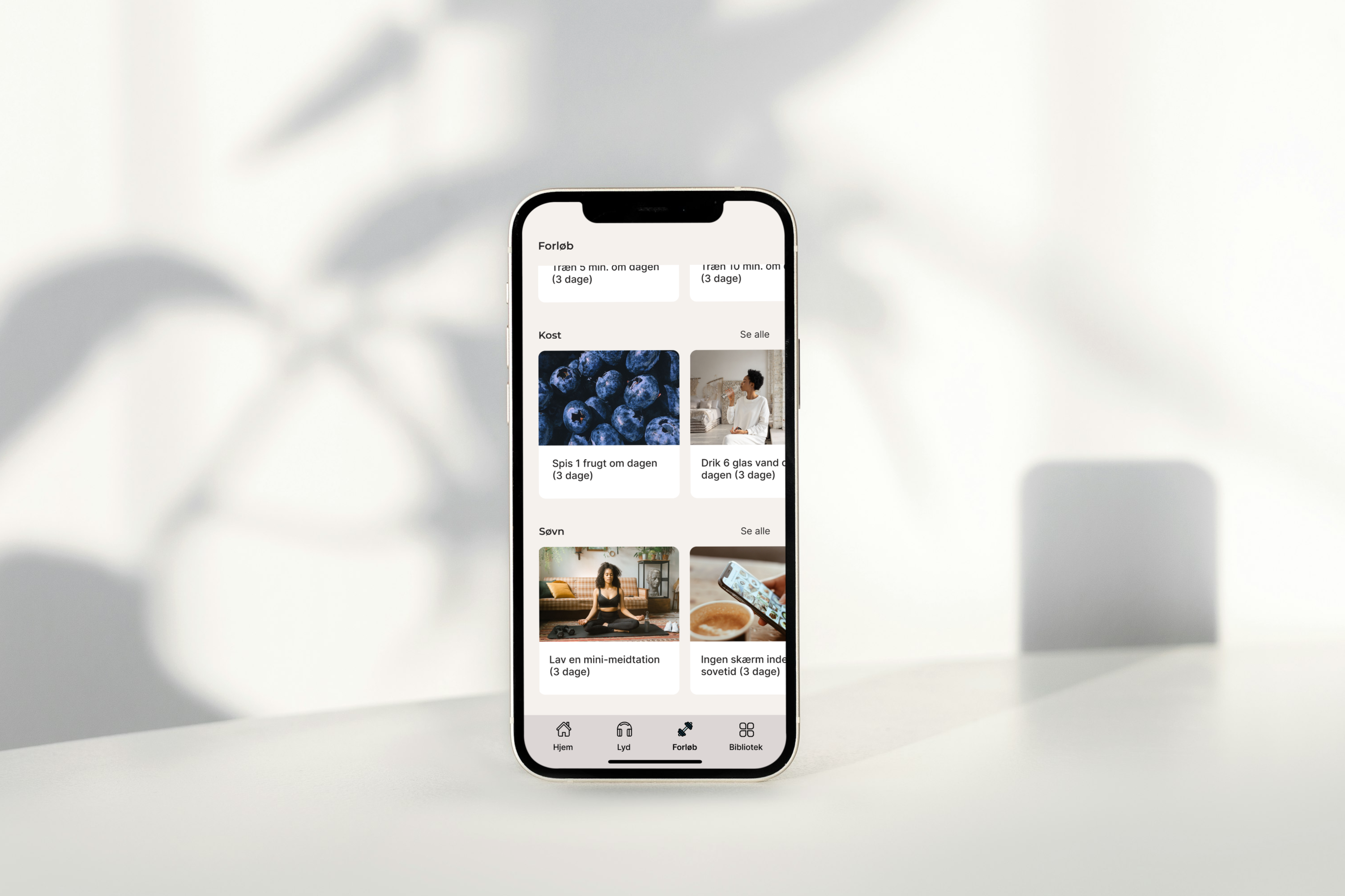
A health + wellness app
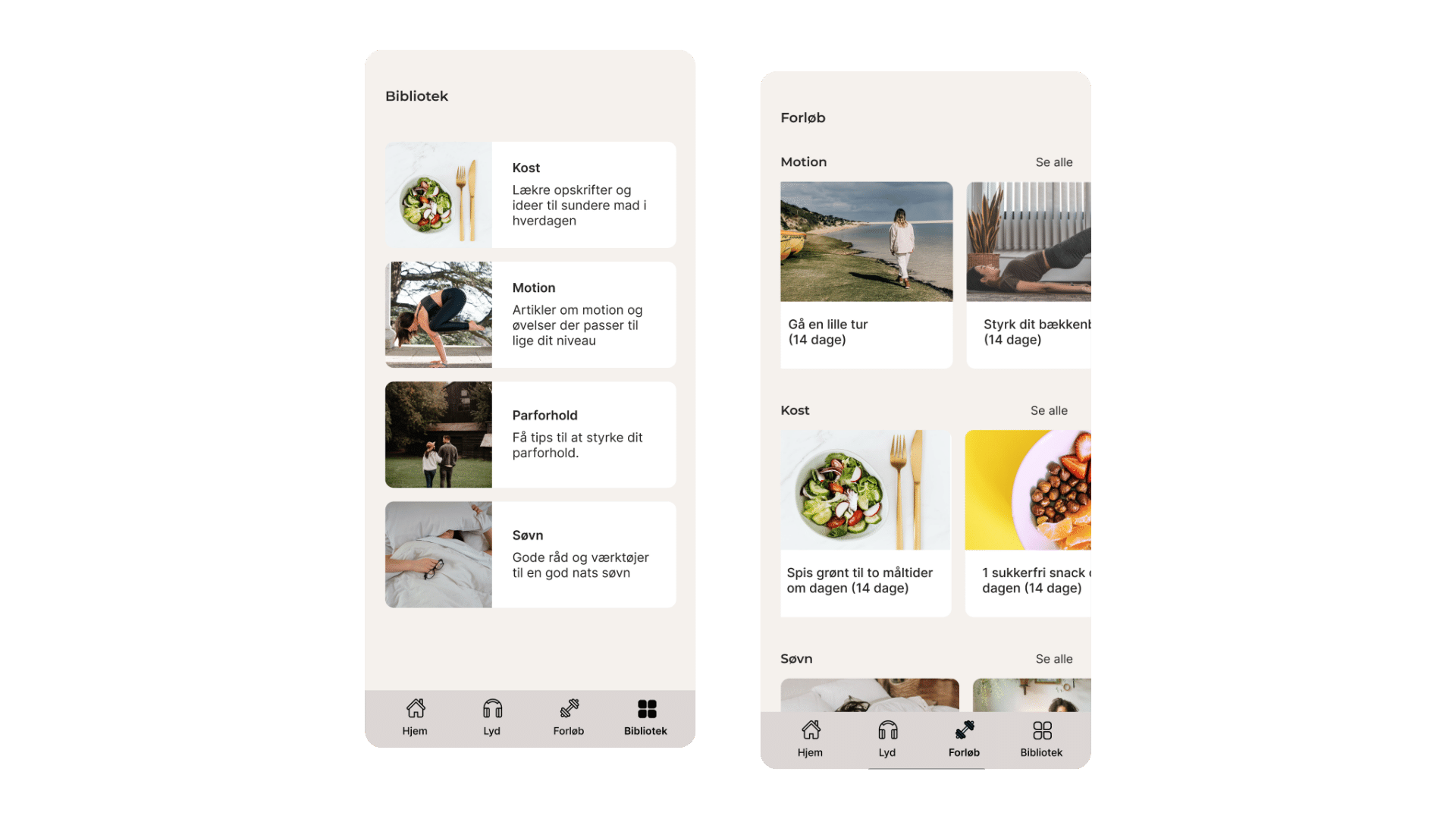
With a built-in library containing workouts, recipes and mini-courses.

The Problem
Parents with small children often have very busy lives and therefore lack the energy to prioritize their health.
As a result they have a tendency to end up with a liftestyle based on what is easiest and least time-consuming, thus putting them in risk of developing diabetes or other health-related issues. The problem with most health and wellness apps on the market today are that they target people who have a more flexible everyday life than parents with small children do. In collaboration with UCL and the Steno Diabetes Center, we would create a solution to support parents with small kids on their journey to a more healthy lifestyle.
"How might we... | busy parents?"
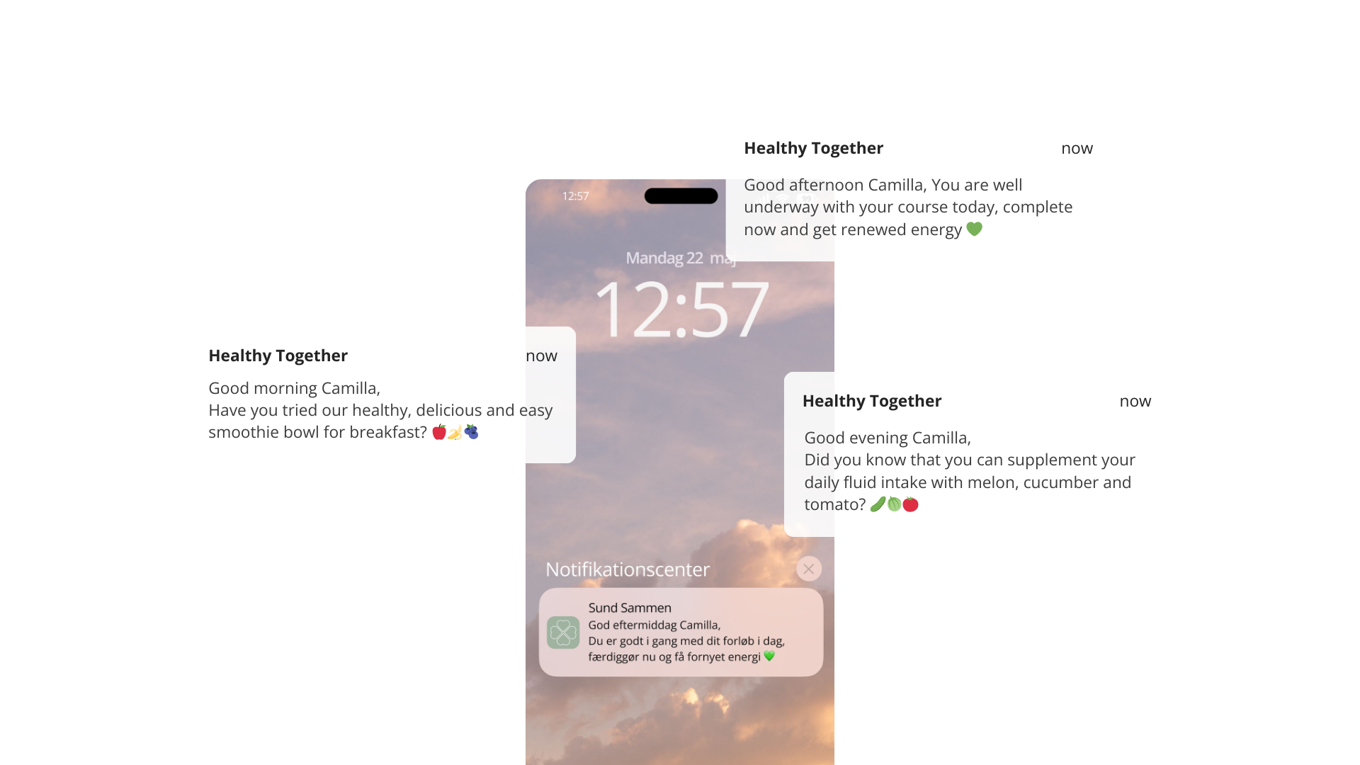
Motivation using nudging
Reminding users of current workouts and messages about how even small steps can improve their health.

Designing the solution
Designing a health and wellness app for users that have an inflexible schedule, limited time and a lack of motivation.
Ahead of the design phase, we did secondary research on how to include motivation in the
design. We also sent out a questionnaire to
78 parents from the target group and carried out 5 face-to-face interviews to get an
in-depth understanding of the parents' everyday lives.
Based on the findings from the research we learned that:
- a majority of the respondents felt that they lack the energy to
work
out and make healthy dinners, just as they can't
find time in the busy day where they won't be interrupted.
- the solution should include the use of nudging
in form of notifications, to gently remind the parents about the mini-courses
they are a part of and messages about how also small steps can have a big
effect on their health.
- a built-in library with mini-courses and short, but effective, training sessions should be implemented, that take into account that the parents have an inflexible schedule and their current fitness level.
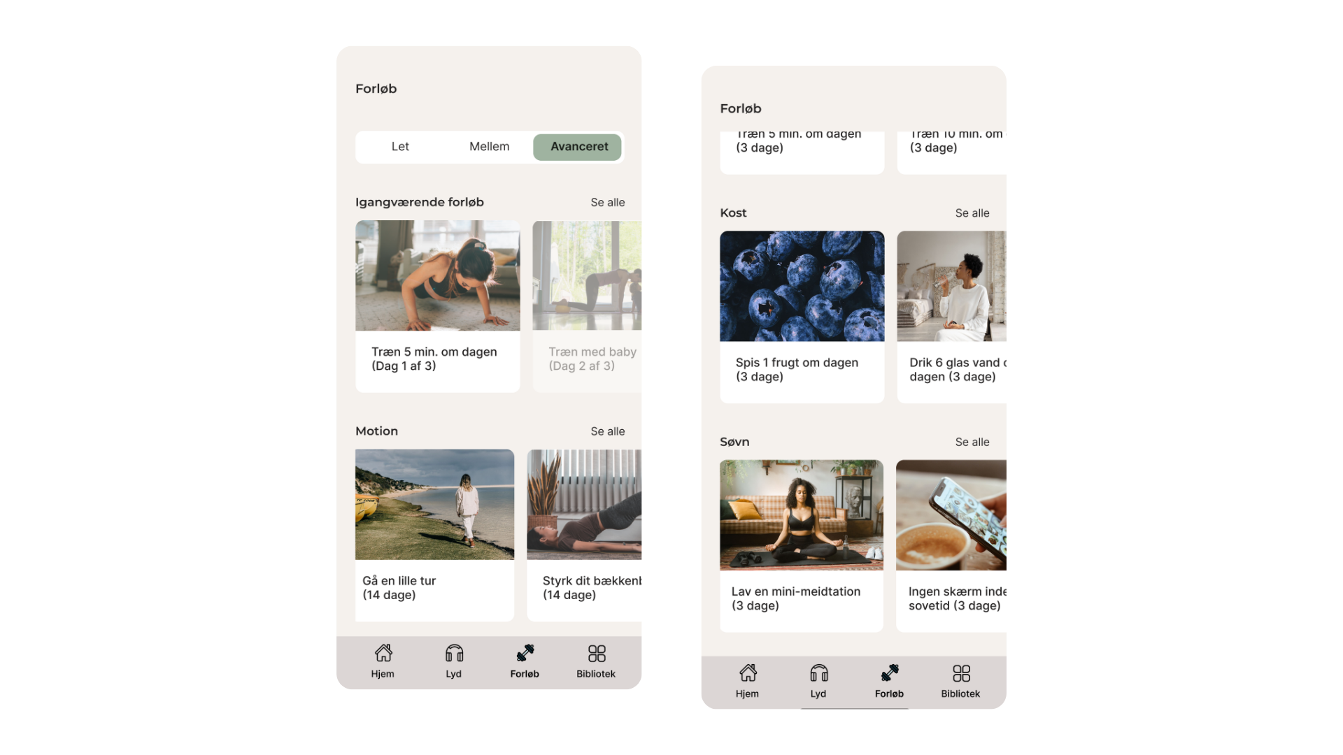
Customization and flexibility
Choose a workout or mini-course that aligns with your current level and your life situation.

Testing the concept
5 usability tests were conducted among parents from the target group to test the concept of the app.
60% of the participants were excited about the mini-courses and it's flexibility, where the rest believed that they would primarily use the app to get inspiration for recipes and healthy food. Although being a core function of the app, 2 out of 5 wanted the option to deny notifications entirely, as too many notifications would have a negative impact on their stress levels.
What's next?
Based on the results from the usability tests, it was concluded that 'Healthy Together' in theory could help busy parents achieve a healthier life. However, it would be necessary to create a beta version of the app to be tested by a segment from the target group over a longer period, in order to prove that the concept can improve their health in practice. (This case only shows a small sample of the user research that has been conducted during the project. If you would like to hear more about our work, please feel free to contact me at piahelenestorm@gmail.com)
Go to top